Caching plots in Shiny
Bringing Shiny into production
In the past few days I spent some spare time going through a bunch of old rstudio::conf talks about scaling and deploying Shiny apps into production. Dashboard latency times, load times and general dashboard reactivity come regularly as the main challenges to overcome in order to provide a good user experience and ensure good adoption. As a general rule of thumb, the following strategies seemed to come up regularly in the talks:
- Move away long running computations and ETL processes away from the user. Most of the time, it is not necessary to pull and crunch data from a database every new session. This can be easily avoided by setting up a CRON job that pulls data and aggregates it overnight. Your mileage will obviously vary depending on how frequently you’ll need your data updated.
- On the UI side, use dynamic components wisely. One could start with
a fairly simple UI set and add complexity at a later stage via
insertUI/removeUIcalls. - When dealing with large data frames,
data.tablemight be preferred todplyrfor its speed efficiencies. - If your dashboard spends most of the time building plots, caching them will cut wait times with some caveats that will be explored later.
- Finding bottle necks can be cumbersome in large and complex
dashboards. Profiling the dashboard with
profvisshould clarify where the dashboard is spending most of its computing time.
The following post aims to be a straightforward walk through on how to implement a simple cache (using Redis) and analyzing the consequent speed improvements.
Caching plots
I deeply recommend this post from Winston Chang for exhaustive documentation on the several nuances of caching plots in Shiny. For clarity’s sake, the following example app will be used as a test throughout this post:
library(shiny)
library(dplyr)
library(ggplot2)
library(R6)
library(redux)
ui <- fluidPage(titlePanel("Plot Caching Test"),
sidebarLayout(sidebarPanel(
selectInput("number", choices = seq(80000, 100000, by = 10000),
label = "Number of points", selected = 5000)
),
mainPanel(plotOutput("point_plot"))))
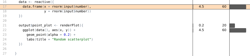
server <- function(input, output) {
data <- reactive({
data.frame(x = rnorm(input$number),
y = rnorm(input$number))
})
output$point_plot <- renderCachedPlot({
ggplot(data(), aes(x, y)) +
geom_point(alpha = 0.8) +
labs(title = "Random scatterplot")
},
cacheKeyExpr = { list(input$number) }
)
# Set up redis cache object
RedisCache <- R6Class(
"RedisCache",
public = list(
initialize = function(..., namespace = NULL) {
private$r <- redux::hiredis(host = '127.0.0.1', port = 6379)
# Configure 20mb cache
private$r$CONFIG_SET("maxmemory", "20mb")
private$r$CONFIG_SET("maxmemory-policy", "allkeys-lru")
private$namespace <- namespace
},
get = function(key) {
key <- paste0(private$namespace, "-", key)
s_value <- private$r$GET(key)
if (is.null(s_value)) {
return(key_missing())
}
unserialize(s_value)
},
set = function(key, value) {
key <- paste0(private$namespace, "-", key)
s_value <- serialize(value, NULL)
private$r$SET(key, s_value)
}
),
private = list(r = NULL,
namespace = NULL)
)
shinyOptions(cache = RedisCache$new(namespace = "example_app"))
}
shinyApp(ui, server)
From the code above, two main things should be noted:
- The declaration of a
RedisCacheobject, pointing to the IP address of the Redis server (in this case a local Redis docker container). cacheKeyExprdeclares the UI element that when touched or changed will invalidate the cache, forcing the plot to be redrawn.
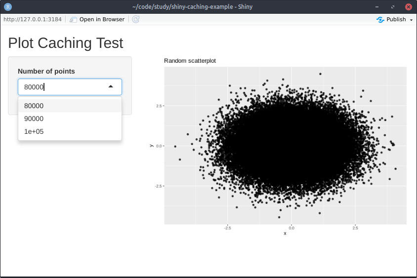
Below a screenshot of the resulting example:
In this example, a Redis server will be spun up through Docker:
docker run -d -p 6379:6379 --name cache redis
It is possible to verify the server has come live correctly by checking
docker ps output.
Measuring speed benefits
Upon interaction with the dropdown menu, the application generates some
data-points and draws a scatterplot, the number of points to be plotted
is large enough to make plotting fairly time consuming. Caching plots is
particularly useful when the same output is frequently requested by
users (e.g weekly sessions, conversion rate by campaign, etc.). In order
to simulate simultaneous multi-user activity,
shinyloadtest will be
used. Simulating activity load with shinyloadtest is a two-step
process:
-
Record a typical user session (e.g interacting with dates, drop-downs, etc) with
shinyloadtest::record_session("http://127.0.0.1:3184")
After closing the browser tab arecording.logfile will be generated, encoding all the mock user activity just simulated. -
Now it is time to launch parallel user sessions with the user interactions just recorded. For example, something like
shinycannon recording.log http://app_url:port --workers 5 --loaded-duration-minutes 3 --output-dir test_runwill simulate 5 users, interacting with the app for 3 minutes using the interactions recorded inrecording.log.
In order to better understand the magnitude of speed benefits introduced by plot-caching, the following scenarios were simulated:
- 25 concurrent users with cache enabled
- 50 concurrent users with cache enabled
- 100 concurrent users with cache enabled
- 200 concurrent users with cache enabled
- 5 concurrent users with cache disabled
After running all the above scenarios (making sure to flush the cache
each run via docker exec -it cachce redis-cli FLUSHALL), a number of
folder containing logs for each session will be created. shinyloadtest
already has builtin functions to import, parse and compute relevant
metrics from these log files. Total session time will be the main
metric against which performances will be assessed.
library(shinyloadtest)

# Import laodtest runs
cached_200 <- load_runs("200_users_cached/")
cached_100 <- load_runs("100_users_cached/")
cached_50 <- load_runs("50_users_cached/")
cached_25 <- load_runs("25_users_cached/")
uncached_5 <- load_runs("5_users_uncached/")

# Merge dataframes
df <- rbind(cached_200, cached_100, cached_50,
            cached_25, uncached_5)
library(dplyr)
glimpse(cached_100)
## Observations: 11,886
## Variables: 13
## $ run               <ord> 100_users_cached, 100_users_cached, 100_users_cache…
## $ session_id        <int> 0, 0, 0, 0, 0, 0, 100, 100, 100, 100, 100, 100, 200…
## $ user_id           <int> 0, 0, 0, 0, 0, 0, 0, 0, 0, 0, 0, 0, 0, 0, 0, 0, 0, …
## $ iteration         <int> 0, 0, 0, 0, 0, 0, 1, 1, 1, 1, 1, 1, 2, 2, 2, 2, 2, …
## $ input_line_number <int> 4, 5, 7, 8, 10, 12, 4, 5, 7, 8, 10, 12, 4, 5, 7, 8,…
## $ event             <chr> "REQ_HOME", "WS_OPEN", "WS_RECV_INIT", "WS_RECV", "…
## $ start             <dbl> -15.003, -14.974, -14.921, -14.918, -8.782, -4.934,…
## $ end               <dbl> -14.976, -14.944, -14.919, -12.637, -6.348, -1.827,…
## $ time              <dbl> 0.027, 0.030, 0.002, 2.281, 2.434, 3.107, 0.220, 0.…
## $ concurrency       <dbl> 0.0, 1.0, 1.0, 1.0, 41.5, 63.5, 92.5, 89.5, 93.0, 9…
## $ maintenance       <lgl> FALSE, FALSE, FALSE, FALSE, FALSE, FALSE, TRUE, TRU…
## $ label             <ord> Event 1) Get: Homepage, Event 2) Start Session, Eve…
## $ json              <list> [["REQ_HOME", 2020-03-01 18:42:58, 2020-03-01 18:4…
library(ggplot2)
library(scales)

# Plot session times
df %>%
  group_by(run, session_id) %>%
  summarise(tot_time = sum(time)) %>%
  ggplot(aes(run, tot_time, fill = run)) +
  geom_boxplot() +
  scale_y_continuous(trans = "log10",
                     breaks = trans_breaks("log10", function(x) 10^x),
                     labels = function(x)round(x,2)) +
  scale_x_discrete(labels = c("25 Users\n Cached", "50 Users\n Cached",
                              "100 Users\n Cached", "200 Users\n Cached",
                              "5 Users\n No Cache")) +
  theme(legend.position = "none") +
  labs(y = "Session time (secs)",
       x = NULL)
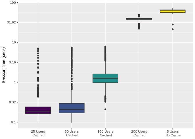
As it can be easily noticed, the app supports up to 100 concurrent users
without missing a beat (completely acceptable total session times). At
200 concurrent users, performances start to look similar to the no-cache
scenario. After inspecting computing times with profvis, it can be
noted that the problem is actually the rnorm call trough which mock
data generated.
Data generation could be made faster by caching the data frame (just
like plots). I haven’t personally explored this as the
DataCache package looks out of
date and not actively maintained anymore. The good news is that the
relationship between number of users and session time looks linear,
hence throwing more hardware at the problem could be considered as a
stopgap fix.
Closing remarks
This post has highlighted that there are undeniable benefits in caching plots when dealing with multiple concurrent users. The toy examples described above were tested locally, in a production environment it considered good practice to run load testing from a different server as the resources needed to generate fake traffic might influence app performances.
In order to dig deeper on the test runs, shinyloadtest offers an
extensive html report. The report can be generated after importing and
crunching all the test run files:
library(shinyloadtest)

df <- load_runs(
  `5_uncached` = "5_users_uncached/",
  `25_cached` = "25_users_cached/",
  `50_cached` = "50_users_cached/",
  `100_cached` = "100_users_cached/",
  `200_cached` = "200_users_cached/"
)

# Make report
shinyloadtest_report(df)
References
shinyloadtest: load testing suite for Shiny applicationsprofvis: profiler for R applications- toy example apps used in this post
R6: interface with R6 classesredux: interface package with Redis server