Playing around with streamlit dashboards
- Intro
- Exploring a few tools
- Project structure
- Overview of
dplyractivity - Deploying + Streamlit Share + Google App Engine
- Closing remarks
- [Extra] Profiling slow methods
- References and notes
Intro
A few weeks ago I have stumbled upon this post on hackernews containing a captivating piece of data visualization on the development history of git. I believe the visualization is particularly powerful for a few different reasons:
- It packs a lot of information in a clear and concise way without being overwhelming
- It is aesthetically very appealing
- It as some basic interactivity, letting the user drill down on each individual contributor
Lacking a traditional background in computer science, I’ve never thought of the type of data that could be generated by the development process itself. This sparked my interest to build a simple dashboard with the following requirements:
- Doesn’t have to be aesthetically appealing. This choice has been taken out of sheer laziness: I definitely wanted to avoid spending too much time wrestling with css code over a weekend.
- Should allow users to explore any repo they can think of
- Should allow to filter commits by date
- Should allow users to filter commits by contributor
The final dashboard is publicly available here
Exploring a few tools
I am a long time {shiny} user and it is hands down my go-to library for any dashboard that goes beyond
average complexity. Over the years, its development process has greatly improved, going from monolithic files to libraries
supporting a more modular and workflow-oriented approach.
In the past year or so I’ve been working mostly on Python projects as putting R in production is not a viable option, as most of the clients I’ve dealt with wouldn’t have internal resources to maintain production-ready R code. Instead of building yet another Shiny app, I set myself to find something equivalent in Python.
Surprisingly enough, finding something as mature and easy to use as Shiny has being sort of a struggle. The following are a bunch of libraries I’ve found during research and not all of them have been researched in much detail (hence feel free to disagree on any of the comments below):
- Plotly dash: albeit Plotly being one of the most common plotting libraries (allowing extensive interactivity) I
decided not to go with this option for a few reasons:
- I wouldn’t be able to mix plotting libraries if a specific visualization required anything more specific.
- You can definitely solve the point above by fiddling with
flask(used for its backend) but I could see myself spending more time on it than on the actual visualization - It lacks a proper layout template meaning that I’d have to arrange and style each component by hand and write proper .css stylesheets
- Bokeh: looks like a nice visualization library with some interactivity baked in it. Unfortunately the “dashboarding” part is left to the user.
- Spyre: abandoned project (last commit dating back to 3 years ago).
After some research I decided to give streamlit a go as it offers the right amount of interactivity and its layout approach, albeit being a bit restrictive, looks flexible enough to churn out something decent in a relatively short amount of time.
Project structure
The project has been structured in the following way:
.
├── app
│   ├── dashboard.py  # the actual dashboard
│   ├── __init__.py
│   ├── repo.py  # some helper functions to download data
│   ├── ui.py  # plot functions
│   └── utils.py  # some dashboard-related helpers
├── Dockerfile
├── README.md
└── requirements.txt
This allows to keep the app organized in three distinct blocks with the following logic:
- Everything related to plotting and user interaction should live in
ui.py. This could be further split intoplots.pyandui.pywhen building large apps to avoid having too much stuff in the same module - Data preprocessing and helper methods live in
utils.py - The dashboard is assembled in
dashboard.py repo.pydeals with retrieving the commit history from a remote git repository
Following the logic above, a very stripped down app might look like something in the lines of:
import streamlit as st

import utils
import ui


def body(data):
    # Grab the sidebar filter values declared in `ui.py`
    a = ui.get_sidebar(data)

    # Filter data
    data  = utils.filter_by_a(data, a)

    # Display dataframe in a container
    with st.beta_container():
        ui.write_table(data)


if __name__ == "__main__":
    data = utils.get_data()
    body = body(data)
import streamlit as st
import utils

def get_sidebar(data):
    # Just one filter as an example
    a_max = int(data['A'].max())
    a_min = int(data['A'].min())
    a = st.sidebar.slider("Filter by A", min_value=a_min, max_value=a_max)

    # NOTE: you can return a tuple if mulitple filters are applied
    return a

def write_table(data):
    return st.dataframe(data, height=1000)
import streamlit as st

import pandas as pd
import numpy as np


def get_data():
    # Just generate some random data
    seed = np.random.RandomState(seed = 1234)
    df = pd.DataFrame(seed.uniform(low=0,high=100,size=(100, 5)), columns=list('ABCDF'))
    return df


def filter_by_a(data, val):
    return data[data['A'] >= val]
I am sure there are plenty of better ways to organize code especially for larger projects (leveraging folders for instance), but the current structure has been more than enough for the size of this experiment.
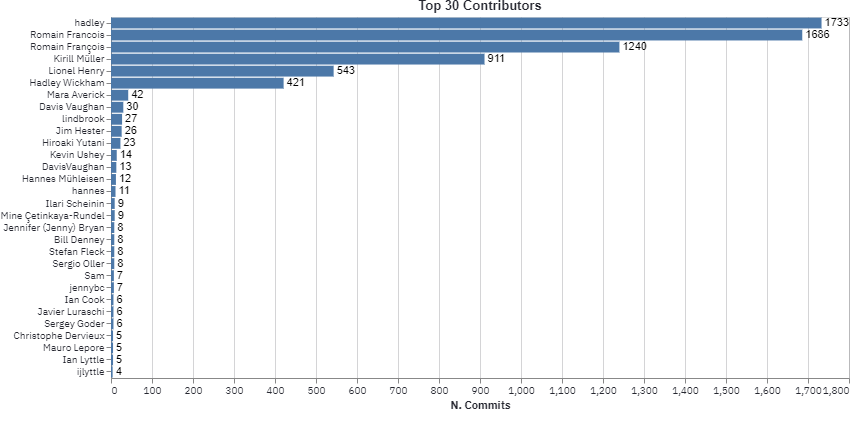
Overview of dplyr activity
Coming from an R background it came pretty natural to have a look at {dplyr} commit history. As expected, it is
clear how the bulk of the library was written by Hadley, Romain Francois, Kiril Muller and Lionel Henry.
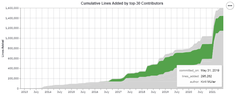
Also, it seems that most contributors have added a large number of lines around January 2021. This makes
perfect sense as around that time dplyr 1.0.3 was released.
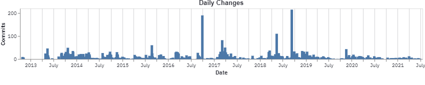
Rebuilding documentation is one of the central steps of R package development workflow, this can be spotted by comparing the number of daily commits and lines changed. Surprisingly there have been days in which the number of commits has been fairly small while having touched a large number of lines. Such pattern can be spotted in late January 2021:
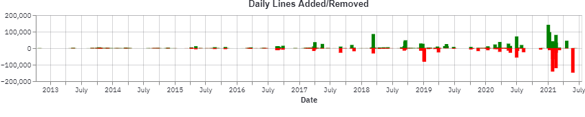
In fact, on Jan 29 2021 a large update to the revdep/ folder
(containing information on reverse dependencies) was performed, resulting in the deletion of revdep/failures.md and revdep/problems.md, each containing 50k+ rows.
As a bit of a surprise I’ve noticed some duplication in contributor names (Romain Francois vs. Romain François) which is completely fine given it is fairly common to change machines and rewrite your .gitconfig file over the years. I might add some de-duplication logic in some future revision.
Deploying
Streamlit Share
For showcasing simple enough dashboards, if control over machine type and setup flexibility is not a strong priority, streamlit already offers a platform to publicly share dashboards. This solution is invite-only but it only took ~24h to get an invite code in my case.
To set it up it is enough to have your dashboard files in a public repository (containing a reuqirements.txt file) and deploy a new app from the GUI.
You can check the final result at this link.
Google App Engine
When expecting large traffic volumes on a dashboard, Google App Engine can come to the rescue. This solution (as most of cloud providers) is particularly appealing due to managed auto-scaling features. The first requirement for the deployment is to have a Dockerfile in place, it might be something along the following lines:
FROM python:3.9-slim-buster

# The dashboard can pull remote git repos
RUN apt-get update && \
    apt-get -y install git

COPY . .

RUN pip install -r requirements.txt

WORKDIR app/

EXPOSE 8501
ENTRYPOINT ["streamlit","run"]
CMD ["dashboard.py", "--server.port=8080", "--server.address=0.0.0.0"]
Secondly, a app.yaml file, containing deployment settings (auto-scaling settings will be set in this file) is needed:
service: git-streamlit
runtime: custom
env: flex
Finally, we can deploy everything with a simple one-liner:
$ gcloud app deploy app.yaml
After this step, we should find the url for the freshly deployed app in console output.
Closing remarks
I’ve found streamlit extremely intuitive and was surprised by the extremely small number of roadblocks I’ve encountered. As of July 2021 I think the tool feels a bit
like notebooks on steroids (not to be taken as a negative comment). While thinking about the whole journey, few points crossed my mind:
- Albeit I was building a very simple dashboard, I couldn’t find any established best-practice on how to organize a very large project.
- Scalability:
altairplotting library stores the entire dataframe on the client, this forces to pre-aggregate the data before plotting. pydriller, used to interact with git repositories, is a very powerful library but it can take a long to traverse through large commit histories. In case you want to analyse very long commit histories I’d suggest to use therepomodule (can be used as a cli utility) to process a commit histories and feed the dashboard the resulting .json file. This could be scheduled as a cron job that will download all commits for the previous day to (to avoid downloading the entire commit history each time), I can see this approach working when setting up a raspi for a big screen in an office.- Being as very simple weekend project, I’ve consciously decided to overlook testing. Two points can be raised about it:
- Data aggregation could be factored out from plotting methods to test them independently.
- Frontend should be tested using a browser emulation like
seleniumas described in this article. The approach is identical to testing Shiny apps: open the app, take a screenshot and check it is identical to a reference one previously stored.
[Extra] Profiling slow methods
After deploying the app on streamlit share I’ve dropped a short post on r/Python to get some
traffic and observe the dashboard behaving in a semi-realistic scenario. From the start it was clear how somehting in the app/repo.py script was causing problems as the machine kept
dying when computing metrics for largish repos. Through line_profiler it is possible to inspect the execution time of every single line of code:
$ python -m kernprof -lv -u 0.1 test_bench.py
processing repo with 10 workers
Wrote profile results to test_bench.py.lprof
Timer unit: 0.1 s

Total time: 6.87896 s
File: test_bench.py
Function: main at line 8

Line #      Hits         Time  Per Hit   % Time  Line Contents
==============================================================
     8                                           @profile
     9                                           def main():
    10         1          0.0      0.0      0.0      repo_path = 'https://github.com/andodet/anddt.git'
    11         2          0.0      0.0      0.0      for w in n_workers:
    12         1          0.0      0.0      0.0          print(f'processing repo with {w} workers')
    13         1          0.0      0.0      0.0          start = time.time()
    14         1          0.0      0.0      0.0          repo = Repository(repo_path, num_workers=w)
    15         1          0.0      0.0      0.0          res = []
    16        35         26.4      0.8     38.3          for commit in repo.traverse_commits():
    17        68          0.0      0.0      0.0              res.append(
    18        34          0.0      0.0      0.0                  {
    19        34          0.0      0.0      0.0                      "hash": commit.hash,
    20        34          0.0      0.0      0.0                      "author": commit.author.name,
    21        34          0.0      0.0      0.0                      "committed_on": commit.committer_date.strftime("%Y-%m-%d %H:%M:%S"),
    22        34          0.0      0.0      0.0                      "authored_on": commit.author_date.strftime("%Y-%m-%d %H:%M:%S"),
    23        34          4.4      0.1      6.4                      "lines_added": commit.insertions,
    24        34          4.5      0.1      6.5                      "lines_deleted": commit.deletions,
    25        34          4.6      0.1      6.6                      "files_touched": commit.files,
    26        34         28.4      0.8     41.3                      "dmm_unit_complexity": commit.dmm_unit_complexity,
    27        34          0.5      0.0      0.8                      "dmm_unit_interfacing": commit.dmm_unit_interfacing,
    28        34          0.0      0.0      0.0                      "is_merge": commit.merge,
    29        34          0.0      0.0      0.0                      "message": commit.msg,
    30                                                           }
    31                                                       )
    32         1          0.0      0.0      0.0          end = time.time()
From the output pasted above, it is clear that line 26 is the culprit here. Apparently, this method from pydriller computes
Delta maintainability scores for each commit. Commenting out that line has resulted in a 10x speedup in pulling the repo
and building the dataset.
Obviously this didn’t have anything to do with streamlit or streamlit share themselves as it was caused by not reading some documentation properly…